Utilities and small applications built with open-source library
echarty. They accomplish very specific and uncommon tasks.
Considerable amount of time was spent in design, development and testing
of these modules.
They are fairly priced at $30 each and payable
through Paypal.
Please include module description when ordering under “What is this
payment for ?”. Delivery and support by email. Future versions
could be sent on demand. For questions please contact
us.
Violin chart
Violin charts are similar to boxplot, but show the full distribution of the data. Supports single or grouped datasets. Rich customization including jittered data points and mean.Parameters
- df data.frame with X,Y values (required)
- cvalue name of values column (required)
- cname optional name of names(categories) column
- vertical boolean for vertical(default) or horizontal layout
- lineWidth width of the contour line, default 3
- wcoeff width coefficient for each violin, default is 0.45
- jitter value (>=0) of parameter amount in jitter, default NULL(no jittered points)
- j.* optional jitter points parameters like j.symbolSize
- d.* optional density parameters like d.adjust,d.cut,etc. d.n default is 64
- m.* optional mean point parameters like m.symbol,m.symbolSize,etc. If missing, mean is not shown.
- … optional attributes for the violin contour series
- returns a named list of xAxis, yAxis and series. Series are: custom for violin, optional scatter for jitter and mean.
Keyboard Input Support
Enter keyboard mode with click, exit with Tab
Keys with functions implemented, many more possible:
- arrowLeft, arrowRight = highlight data points to left and right -
pageUp, pageDown = switch series - +, - = zoom chart in and out
3D regression planes
The familiar quakes R dataset is visualized in 3D
environment (lat,long,depth) over an area map with tectonic plate
boundaries. User can show/hide 3D regression planes(s) built from
selected 3D points.
See also 3D regression planes in iris
dataset.
Morphing drilldown
The mtcars R dataset presented with morphing drilldown. There are two levels of data: - top level is an aggregate, like counts by type, or average by type - lower level are the actual data rows
Morphing is achieved between two top levels, and between top and
lower levels.
Eurobarometer Survey
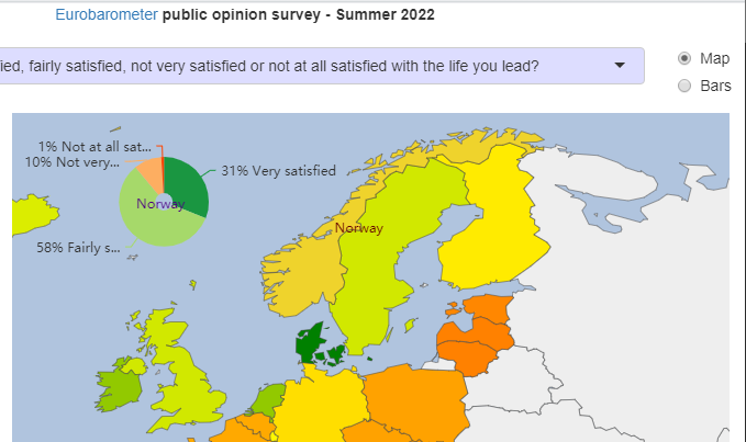
Eurobarometer public opinion survey Summer
2022.
180 questions with multiple answers mapped by country, 26K participants
from 27 countries.
An interactive R/Shiny/echarty app. Live
Demo

Ternary Plots
Interactive - data groups with show/hide, zoom, click, customizable tooltips.3D rotation allows checking for data consistency
The plot depicts the ratios of the three variables as positions in an equilateral triangle. In the example, the three values are sector percentages of a country’s GDP. Their sum should be 100%, but some data may be inaccurate. So by rotating the chart in 3D we could easily find those incomplete data points, for example Belize: 9.7% +13.8% +62.2% = 85.7%Demo example
data is for world countries GDP by economic sectors.
Compressed bars
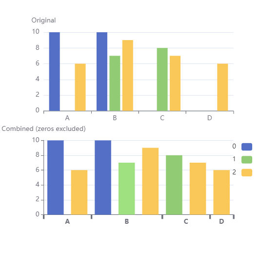
Sparse datasets could show excessive empty spaces in a bar chart. Problem is solved by compressing bars with a non-linear axis. Custom function trimZero will transform the initial dataset and prepare the non-linear axis for display. Below is a comparison sample.View simulated code
tmp <- "
A, B, C,D
10,10,0,0
0, 7, 8,0
6, 9, 7,6"
df <- read.csv(text=tmp, header=T)

tz <- trimZero(df)
ec.init(
  dataset= tz$dataset,
  xAxis= tz$xAxis,
  series= list(list(type= 'bar', encode= list(x= 'x', y= 'value') )),
  visualMap= list(
    type= 'piecewise', top= 10, right= 10,
    categories= tz$vmCat,
    inRange= list(color= c('blue','green','gold'))
  )
)
Quadrant chart
Offers the following options:
- cutomizable axes with or without labels
- points with constant or variable size
- automatic coloring of points and/or point labels by quadrant
- interactivity: tooltip, drag and drop points across the chart
- toolbox button to save chart as PNG
- responsive auto-resize
Only Javascript version currently available.
Axis category groups
Helper function to build a two-level axis, with responsive auto-resize.Only Javascript version currently available, but could be used with ec.init.
View JS simulated code
function grax(dd, vv, ll, gg){...}
dset = [
  ['value', 'name', 'group', 'col'],
  [5, 'apple','fruits','red'],
  [20,'orange','fruits','blue'],
  [36,'kiwi','fruits','red'],
  [28,'carrot','vegetables','green'],
  [22,'lettuce','vegetables',],
  [20,'cabbage','vegetables',],
  [18,'celery','vegetables',null]
];
out = grax(dset, 'value', 'name', 'group')

out.series.find(o => o.type==='bar').itemStyle = {
  color: (v) => { gr= v.value[2]; return gr=='fruits' ? '#482878' : '#1F9E89'; }
}

option = {
  dataset: out.dset,
  series: out.series,
  xAxis: out.axis,
  yAxis: { name: 'val' },
  tooltip: { formatter: (p) => {return 'y=' + p.data[0]; } }
};Zoom pan as data selector
Slide a predefined window on time axis with dataZoom
control. Each pan reposition will read the window start/end values and
search for data in that range. If found, data will be displayed as a
series (line,candlestick,etc.). Demo generates random data.
Only Javascript
version currently available, but could be used with ec.init.
Tree with custom labels
Present hierarchies in style with highly customizable and interactive trees. R version.View data
data <- list(name='Animals', value='Biological Hierarchy',
  label= list(width=160,height=60,backgroundColor='lightgreen', formatter='{b}\n{c}'),
  children= list(
    list(name='Vertebrates',value='with backbone',type='v', pic='https://picsum.photos/50/50/',
      children= list(list(name='Birds',value='warm-blooded',type='v', pic='https://picsum.photos/50/50/'),list(name='Mammals',value='warm-blooded',type='v', pic='https://picsum.photos/50/50/'),list(name='Fish',value='cold-blooded',type='v', pic='https://picsum.photos/50/50/'))),
    list(name='Non-vertebrates',value='without backbone',type='nonv', pic='https://picsum.photos/50/50/',
      children= list(list(name='Arthropods',value='exoskeleton',type='nonv', pic='https://picsum.photos/50/50/',
            children= list(list(name='Insects',value='three body parts',type='nonv', pic='https://picsum.photos/50/50/'))),list(name='Mollusks',value='soft bodies',type='nonv', pic='https://picsum.photos/50/50/')
))))Prepare hierarchical data
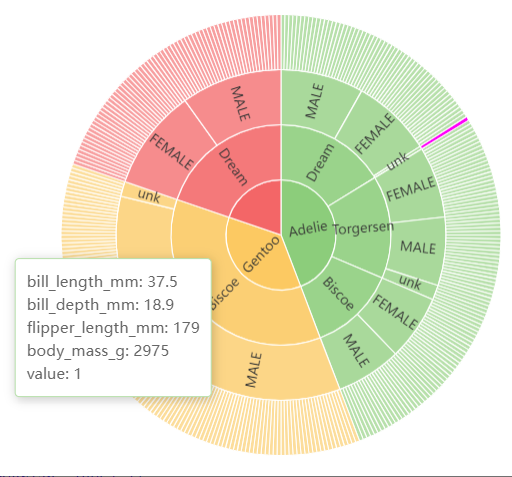
For sunburst, tree, sankey charts.Transforms data.frame with a record for each leaf to a hierarchical list (parent/children).
Useful also to build Krona charts from a variety of CSV sources - example.
See also hierarchies for an overview. Javascript and R versions.
View simulated code
df <- read.csv('https://cdn.jsdelivr.net/gh/mwaskom/seaborn-data@refs/heads/master/penguins.csv')
data <- setHierarchy(df)   # utility
ec.init(
  tooltip= list(formatter= ec.clmn(jfmt), position= c('5%','55%')),
  series.param= list(type= 'sunburst', radius= list(0, 200),
    emphasis= list(focus= 'none', itemStyle= list(color= 'magenta')),
    data= data, labelLayout= list(hideOverlap= TRUE) )
)
